What Bitcoin Did Podcast Appearance - June 2024
Check out all of the charts discussed in our June 2024 appearance on the What Bitcoin Did podcast.
G’day Folks!
This week I had the pleasure of sitting down with Pete and Danny from the What Bitcoin Did podcast to go over the big themes I am seeing across the Bitcoin market. I love sitting down with these two, and the conversation is always a blast.
This post has links to:
The podcast episode.
PDF download for the slides.
Links to the live (and free) charts on the checkonchain Charting Suite.
Enjoy, and let me know if you have any questions or comments!
Have a great weekend,
James
Disclaimer: This article is general in nature, and is for informational, and entertainment purposes only, and it shall not be relied upon for any investment or financial decisions.
The 2023-24 bull market, at a macro scale, has thus far fallen into what I would categorise as ‘Quiet and Trending’. This kind of market structure is extremely healthy, and builds robust support levels on the way higher.
Internally, this is actually characterised as a sequence of quiet and trending rallies, which turn into sideways and volatile consolidations. I covered this market structure in Quiet and Trending.
If we compare the price range between the high and low over the last 90-days, we can see just how quiet the Bitcoin market has become. The orange bars highlight previous periods where volatility was similarly quiet.
Suffice to say, it doesn’t happen often, and indicates higher volatility is likely just over the horizon.
Since the FTX lows, the bears still haven’t managed more than a 20.4% correction, set back in April. This has hallmarks of a spot driven market, and is most similar to the 2015-17 era.
At the $57k lows set in April, I provided commentary on the tools I personally used to stack sats during the volatile down-swing in How I’m Thinking About This Dip.
The MVRV Ratio is one of the most popular onchain metrics, and it describes the Unrealised Profit/Loss held within the coin supply. Here we can see that the volatility in this metric increases when we breach to new cycle ATHs (green).
The reason euphoric bull markets can only run for so long is because of this whipsaw action in everyone’s portfolio value. It tires investors out, and the euphoric phase can usually only sustain itself for 6-12 months as a result.
This chart is one of my favourites of this cycle, and was developed to help dispel the idea that the ETFs were driving all of the price action. The orange and blue areas show the 30-day capital inflows, and Long-Term Holder sell-side occurring onchain.
The ETF inflows (green) and outflows (red) are a meaningful (20% to 30%), but not the dominant factor. The classic Bitcoin spot market remains 4-5x larger than the ETFs, which puts that myth to bed (for now).
Keeping with this theme, we can then look at how much the market cap has changed since the FTX lows, and compare it to various estimates of demand and capital inflows. Here we can deduce that capital saved in Bitcoin onchain (by HODLers) is around $360B since FTX imploded, which created a market cap increase of over $1Trillion at the highs.
The ETFs are once again very small by this measure…and you almost have to squint to see them (red and yellow).
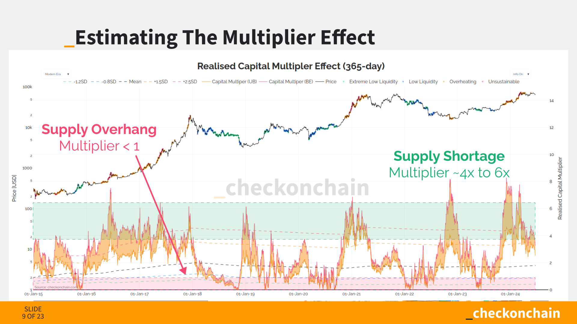
The above two charts were developed in my post about Dispelling the 118x Multiplier Myth, where I sought to estimate the real impact of the marginal dollar. What I found is that even with a cursory back of the envelope calculation, it was near impossible to justify a 100x or even a 50x multiplier (no surprise).
A more realistic estimate in a bull market is around 4x to 6x, meaning every dollar invested (or withdrawn) has a market cap impact of around $4 to $6 (which cuts in both directions).
Futures and derivatives markets are a major factor in Bitcoin market structure, and there have been major shifts over the last 12-months. Binance (yellow) has been the dominant trade venue for many years, however the CME Group exchange has now taken over as the top venue by open interest.
We have also seen Options markets expand to become as large as futures markets, which gives more sophisticated traders and investors instruments to hedge and manage risk.
Both of these dynamics suggest a very real inflow of institutional capital and trade interest is flowing into Bitcoin.
The cash-and-carry trade is an effectively risk-free arbitrage trade which is available in any market that has a futures market. It develops when futures prices trade above the spot market, meaning traders can long spot, and sell it into the future.
This premium has typically traded at around 10% during this bull market, which is ~2x the risk-free-rate of cash equivalents. However this premium has decreased as many traders squeezed into the trade by buying spot ETFs, and shorting CME futures.
It is likely that the majority of the juice which was available to be squeezed via this trade, now has been. I covered these dynamics in two posts; Cash-and-Carry Confusion, and Leverage and Boredom.
Now the this trade may well be market neutral for the trader (as they are long and short). However it may not be neutral in terms of market impact. Since these traders are long spot (via ETFs), and short the future…the unwind means they need to sell the ETF and long the future. Note that futures markets are around 10x larger than spot, so can usually absorb trade volumes more easily.
Trade volumes in the ETFs are relatively light right now, suggesting the unwind of this trade could be a near-term, headwind as sold shares are meeting weaker and thinner books.
I covered this dynamic in a recent post My Spidey Senses are Tingling.
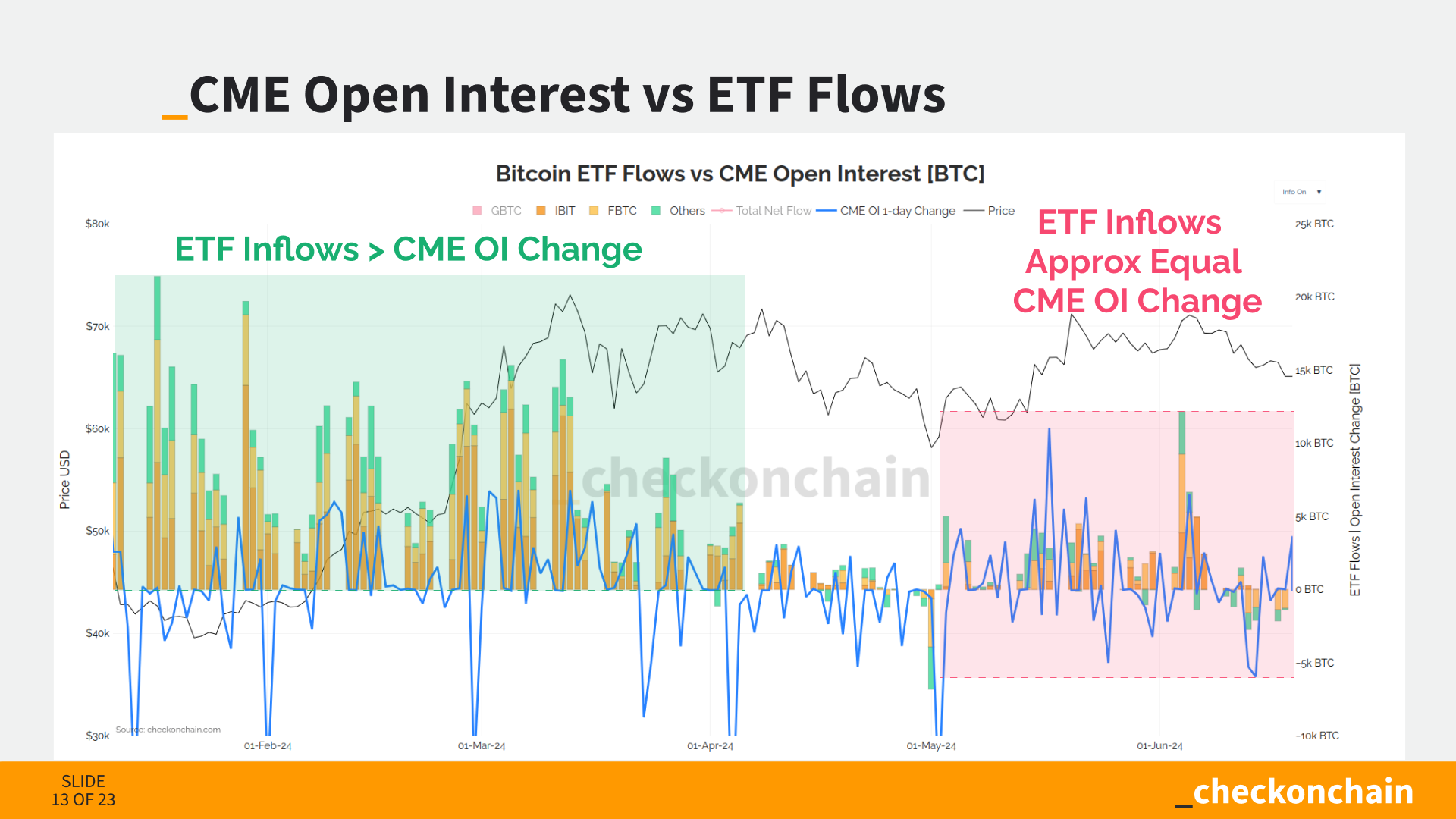
If we compare daily changes in CME open interest and the spot ETF flows, we see a fairly strong coupling between the two markets over recent weeks. This provides a decent argument that the cash-and-carry trade has been a key factor driving ETF inflows since May.
Onchain analysis is all about investor psychology. We can measure the cost basis of each coin, bundle portions of the supply into cohorts (like Long and Short-Term Holders). This allows us to track when large groups of investors are likely to start taking profits, but also where they are likely to see value and buy the dip.
Importantly, these also give levels where we can expect investor behaviour to change, and areas we should look for a breaking of our market thesis.
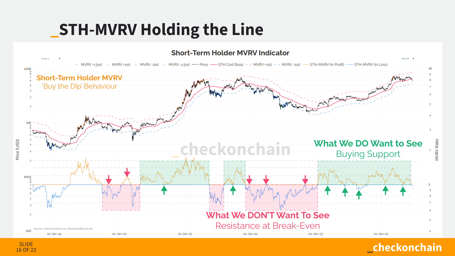
STH-MVRV is one of my all-time-favourite metrics, and describes how in profit recent buyers are. This chart helps us distinguish between ‘buy the dip vs ‘sell-the-rip’ type behaviour.
We are building out an analysis masterclass, which has a module covering how to interpret and read the MVRV Ratio.
STH-SOPR is a sibling metric to MVRV. Where MVRV describes how ‘in the money’ recent buyers are (think paper gains/losses), SOPR tells us about the profit and loss being ‘locked in’ by onchain spenders.
STH-MVRV helps us look for periods where Bitcoin is trading at a discount, and STH-SOPR helps us spot when recent top buyers are panicking at the lows. Markets are all about being a contrarian, and a key part of my personal DCA strategy is buying when both STH-MVRV and SOPR are below 1.0.
The Sell-side Risk Ratio is a measure of implied volatility.
Low Values mean the market has reached equilibrium, and all profit and loss that was going to be taken, has been. The market is ready to move to a new price range.
High Values mean the market is no longer in equilibrium, and the volume of profit and loss being taken is significant relative to the size of the asset.
The major unknown variable in a bull market is demand. We cannot know in advance who will buy, when, and in what size. What we can measure is the sell-side pressure coming from older hands.
The VDD Multiple was developed by my friend TXMC, and is a metric that spots when HODLers with old coins are taking chips off the table. The initial read is that the $73k ETF peak was a meaningful top…but is it ‘a-top’…or ‘THE top’?
I covered this metric in Expecting Chop-solidation, which has helped set my expectations for the market for the months that followed.
To demonstrate the sell-side by HODLers, we can look at their spending patterns, and when they distribute coins consistently over weeks at a time. This sell-side pressure is ultimately what establishes market peaks, both global and local.
Remember, sell-side is also a measure of demand, as every seller is matched with a buyer.
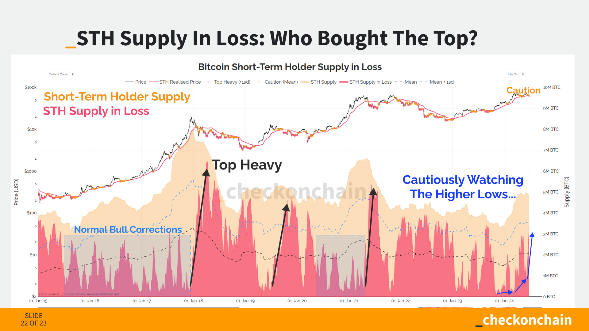
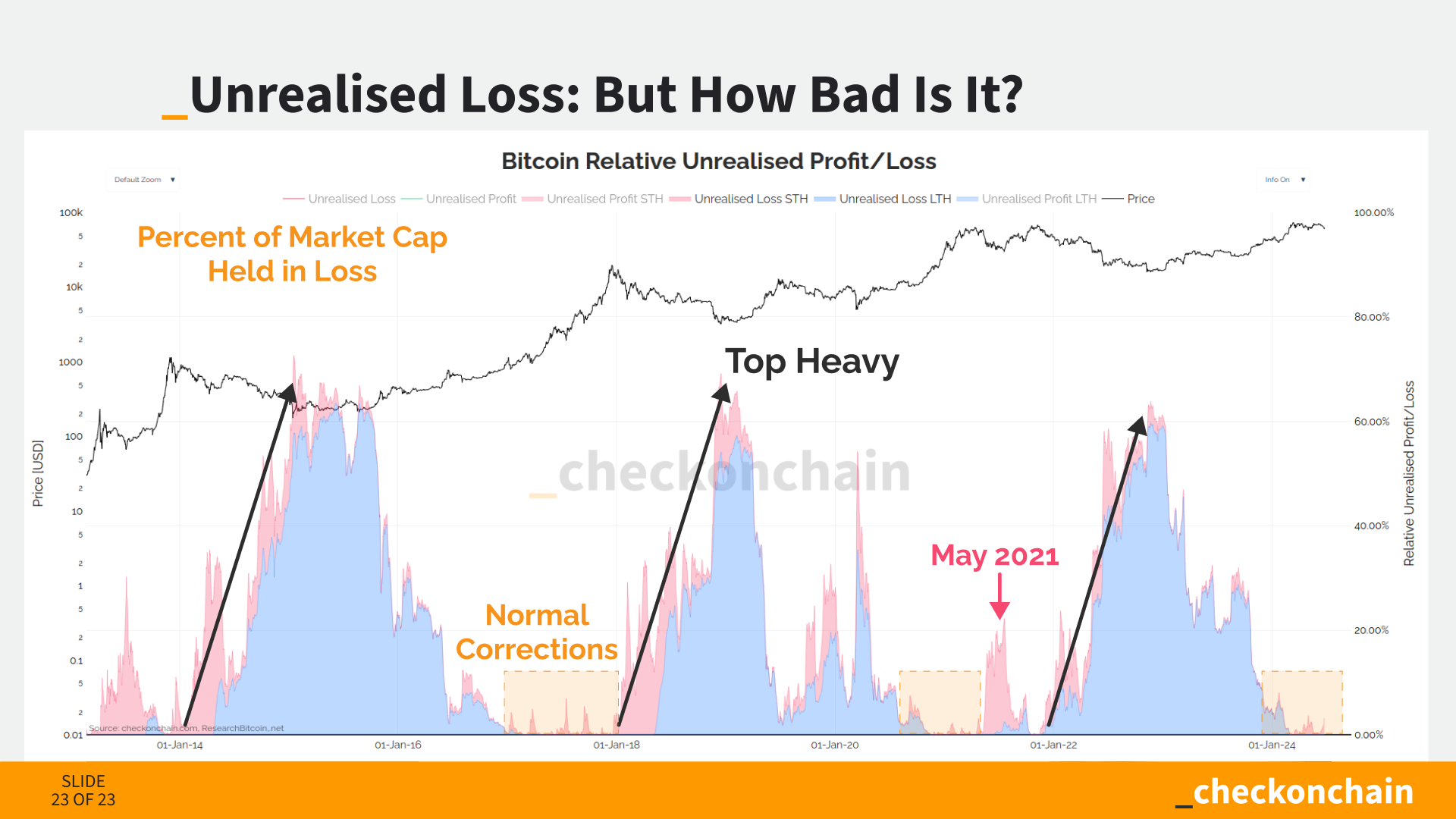
This leads us to one of the most important conditions that I pay attention to when seeking ‘THE TOP’. When you hear me refer to the concept of Top Heaviness, I am referring to the following condition (which creates a bear market);
Bear Markets occur after too many people buy too many coins at too high of a price.
As the market corrects, we get to see how many Short-Term Holders are now underwater on their holdings. Right now, over 75% of their supply is held at a loss, which suggests top heaviness could be in play.
However, there is a big difference between someone who is underwater by -2% vs -20%, so we must ask the question How Bad Is it?
This chart shows the percent of the Bitcoin market cap help in an unrealised loss. If you squint hard enough, you might be able to see the magnitude of loss currently held.
Whilst nobody can predict the future, I personally find it hard to be too concerned about losses of this magnitude. Chop-solidation (bull crab style) remains my base case for now, but I remain very optimistic about Bitcoin on the road ahead.
Thanks for reading, watching, and subscribing folks, I really appreciate it.
Be sure to check out our Charting Suite over at Checkonchain for all the charts above, and many more.
Cheers,
James


