

Chop Chop
The Bitcoin price has now chopped sideways for yet another two months, and is threatening a move back to new ATHs, and into price discovery. Something tells me, we have now chopped enough wood.

G’day Folks,
The Bitcoin price looks primed to move higher on every single time-frame. I took a series of screenshots from TradingView, to demonstrate this sea of green up-trends.
If Bitcoin doesn’t break higher from here, I will eat my Coldcard...

I know I hinted at a piece on the quantum threat for end of week, but I know Tuesday’s piece was a bit weird, cosmic, and heavy on the technical side. So today, we’re going with a good old fashioned market update, which feels more appropriate given how primed Bitcoin looks for another explosive move.
Let’s not muck about, and get straight into the charts.
📈 Reminder: you can find the charts from our articles on the Checkonchain Charting Website, and a guide in our Charts Tutorial Video.
Premium Members will find the TL:DR summary, video update and the rest of the written post below. Consider upgrading to premium today to unlock the rest of the content!
Disclaimer: This article is general in nature, and is for informational, and entertainment purposes only, and it shall not be relied upon for any investment or financial decisions.
TL;DR
Bitcoin looks about ready to launch higher, and the Choppiness Index fuel tank is full of gas on the weekly and monthly time-frames.
The Bollinger bands are tight, volatility is low, and options sellers are, in my humble opinion, mis-pricing the probability of an uptick in volatility moving forwards.
Futures open interest is climbing back towards $80B, and yet funding rates are still 4.5% annualised, equal to the risk free rate in US government toilet paper.
At the same time, there is still plenty of evidence of a net short-side bias in futures markets, with liquidation levels above the $112k ATH looking like a slingshot up to $120k.
To close, I walk through options and onchain pricing models, which line up nicely with an initial target of $130k, and then a potential major peak somewhere closer to $150k to $170 near the end of year.
On the downside, the $95k to $100k should hold as support, and if it was to crack, it would be a signal to seriously rethink the bull thesis.
I also outline how Check the HODLer is thinking about his portfolio decisions should we reach those levels, as it is much easier to think about it now, before the fun starts.
Full Premium Video
The Right Amount of Chop
Chopsolidation has been the theme of this cycle, creating endless frustration for Bitcoiners looking for that hit of high octane volatility, and calm soothing sensations for the average TradFi accumulator.
Definition of Chopsolidation: The kind of market where you could walk away for several months, the price will have gone absolutely nowhere, but the road to get there is lined with the liquidated accounts of both long and short side traders.
It is a process which consolidates gains, drives Bitcoin twitter insane, brings out the claims of price suppression…but all the while builds a resilient and robust price floor of accumulation.
In the 2023-25 cycle so far, we have seen several instances of chopsolidation, across multiple time-frames (and Bitcoin cycles often trade in these fractal patterns).
In 2023, we chopsolidated between $20k and $30k for 7-months.
In 2024, we chopsolidated for 8 months to digest the ETF rally to $73k.
In 2025, we have basically chopsolidated all year, and a bonus 2-month stint above $100k where we find ourselves today.
All of these instances have been a process of building a new accumulation floor, allowing investors to acclimatise to the new altitude, and build up enough energy for the next move.
The ‘Chop’ in chopsolidation gets its name from the Choppiness Index, which is an obscure technical analysis indicator which can be best thought of as a ‘fuel tank for trending’.
High values mean the majority of the recent price candles have traded within the same range, indicating we are consolidating, or within a counter-trend correction. Both of these events allow the market to digest the most recent trend move, and recharge the batteries for the next trending move.
Low values occur after the market has run hard in a certain direction for a prolonged period of time. Markets are still subject to gravity, and cannot go in one direction forever, they need to take periodic breaks, else they run out of gas.
The most powerful feature of the Choppiness Index is when it lines up across multiple time-frames, and right now, the larger weekly and monthly charts are fully gassed up, and ready to trend.
Whilst the CI does not indicate the direction of the trend, we can build a case as to the most likely direction using various other tools (and honestly…it looks like the next move is likely to be higher).

Another popular technical tool people use to model these chopsolidation events are the Bollinger Bands, which tend to squeeze together when the market goes to sleep like this.
The chart below shows the weekly Bollinger Bands, and I have highlighted in orange the periods where they are tighter than they are today.
Notice how we tend to see the upper and lower Bollinger Bands squeeze together in early bulls, and in late bears.
These are also the periods where choppy sideways markets are common, and tend to build up energy for an explosive move (usually in the direction of the established macro trend).
We also have an interesting similarity in the way the Bollinger Bands are trading compared to 2015-16. Waves of price expansion, followed by choppy sideways price action to consolidate the gains.
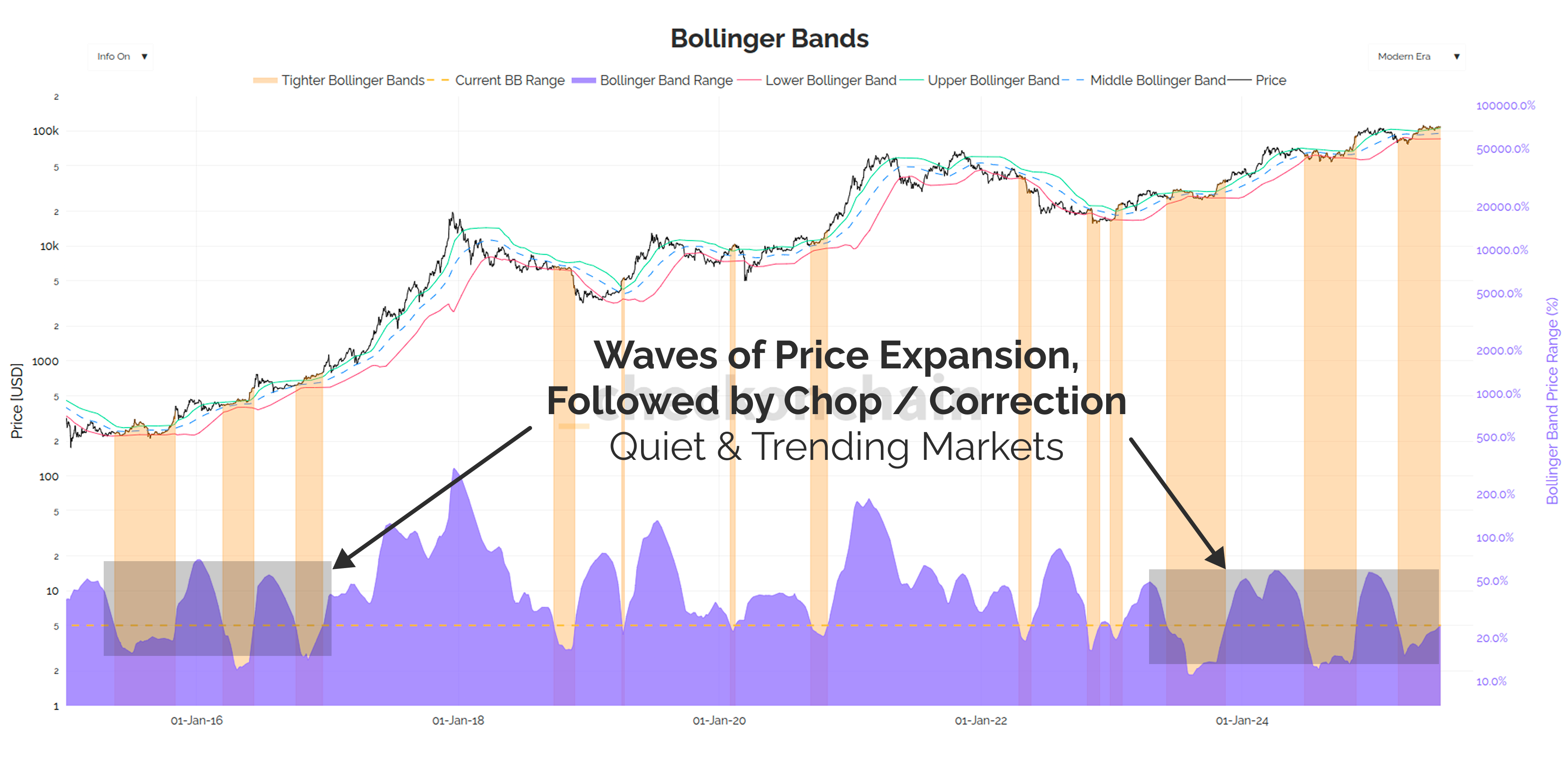
The rolling quarterly return profile has a similar wave shape, where Bitcoin goes on a powerful 80% to 100% run over a few months, and then cools down, and chills out for a few months to recharge.
This is very stable and constructive price action, and what I refer to as Quiet & Trending. It is the kind of market that builds support and investor confidence after each leg higher, and is a very sustainable dynamic.
Shout out to my market mentor Doc Severson, who introduced me to these ideas many years ago.
The thing that is driving commentators on Bitcoin twitter crazy, is the lack of explosive (but unsustainable) price moves like we saw in 2017 and 2021. It remains to be seen if we have such an event, but personally, I’m certainly not going to complain about a casual +100% every few quarters…

The ‘Quiet’ part of this market structure comes from an analysis of the volatility profile, and without question, this has been a major change this cycle.
Historically, Bitcoin has traded very much like a commodity, where volatility rips higher in a bull market, and calms down as the bear unfolds. The equity market is usually the opposite, where bulls trade in boring straight lines higher, and the VIX (Volatility Index) spikes whenever there is a nasty correction.
Whilst volatility has been very quiet so far this cycle, I have a sneaking suspicion we might be on the cusp of a regime of higher volatility.
Whether the increase in speculative leverage, the aggressive buy side from Treasury Companies, or just the pent up energy from investors who have been bored to death by too much chopsolidation.
We will find out soon enough how this thing plays out, but I think volatility is mis-priced here…

The options market disagrees with me, and is pricing in a historically low volatility premium.
Options sellers have been lulled to sleep, and likely into a false sense of security. They are short volatility…and I think that is going to turn out to be a mistake.

Godspeed To The Shorts
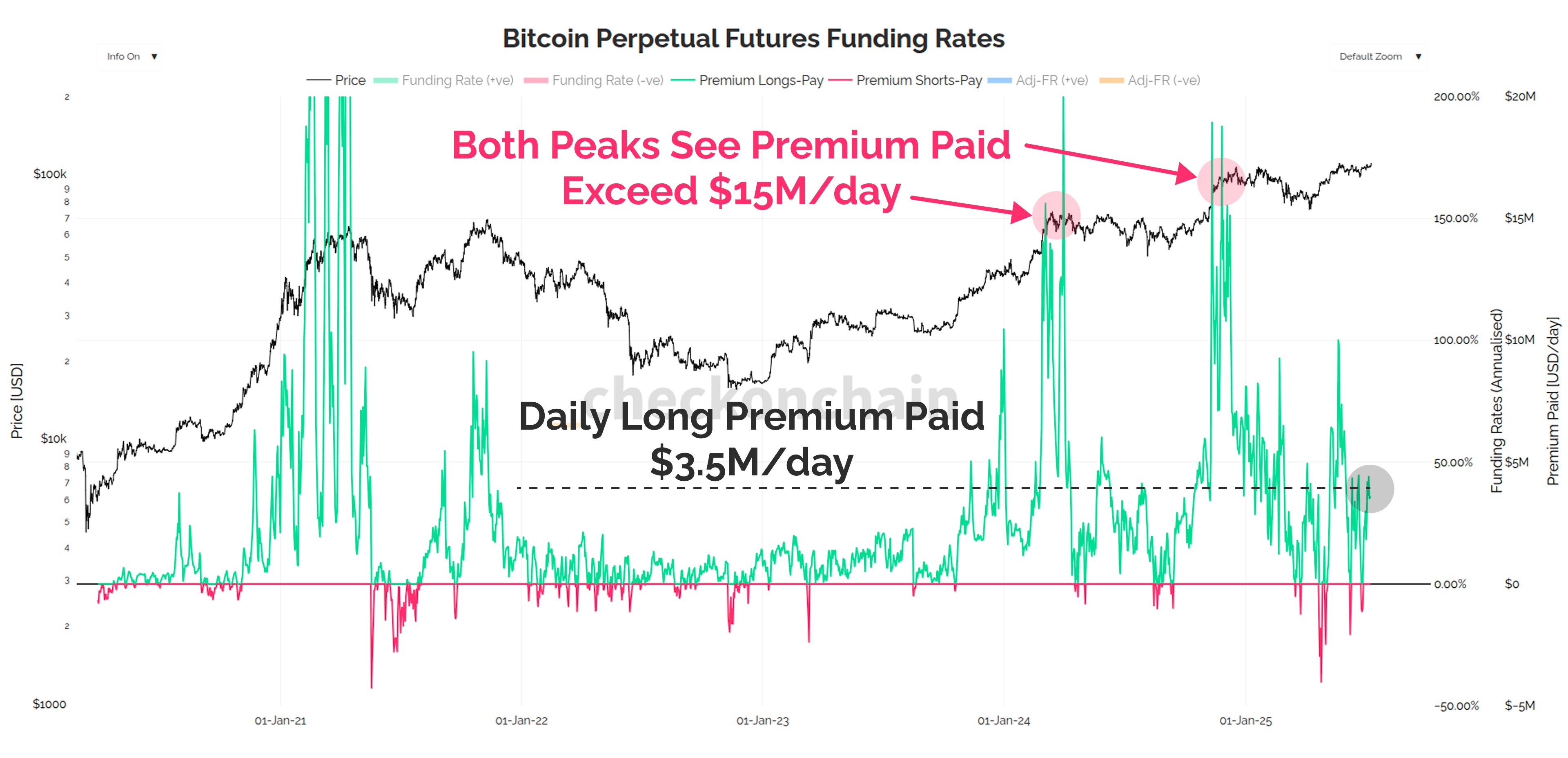
Futures funding rates are currently trading at around 4.5% annualised, which is pretty close to the ‘risk-free’ rate in US Treasuries. The way I usually think about this, is the entities who are large and sophisticated enough to put on carry trades as a core income strategy, are likely also big enough to just buy a T-bill and wait.
In other words, when funding rates are hardly higher than T-bills, as they are today, it suggests there is a lack of long-side speculative bias.
Ironically, a lack of long-side bias, is actually a bull case, because it means there likely isn’t a huge pool of speculators waiting to get flushed out by a sell-off.

Open Interest is still very high, approaching $80B. However, as covered in prior editions, the growth in OI seems to be coming from the longer-tail crypto-native exchanges.
The growth of leverage on CME and Binance is lower than it was in November, and the Top-4 exchanges (CME, Binance, Bybit and Hyperliquid) are basically flat.
We certainly have a lot of primarily speculative and crypto-native leverage in the market…but they are not excessively long to my eye.

Now, funding rates are still positive, and when we multiply aggregate open interest and funding rates, we can estimate a USD value of interest paid by longs or shorts.
Think of this as a sort of open interest weighted funding rate, which can give us a better relative measure of the speculative premium on either side.
From this vantage point, it makes a bit more sense. The market is still ‘bullish’, and paying $3.5M/day, but it is 4x to 5x less extreme than it was at the two major tops of this cycle so far.
Bullish, but not excessively so, which is a good sign.
The collective story here continues to point to a lot of short side interest in the market, as traders try to will a ‘double top’ into existence.
Short liquidation dominance keeps ticking higher on every green candle in recent weeks, which tells me there are a whole lot of white knuckles out there…
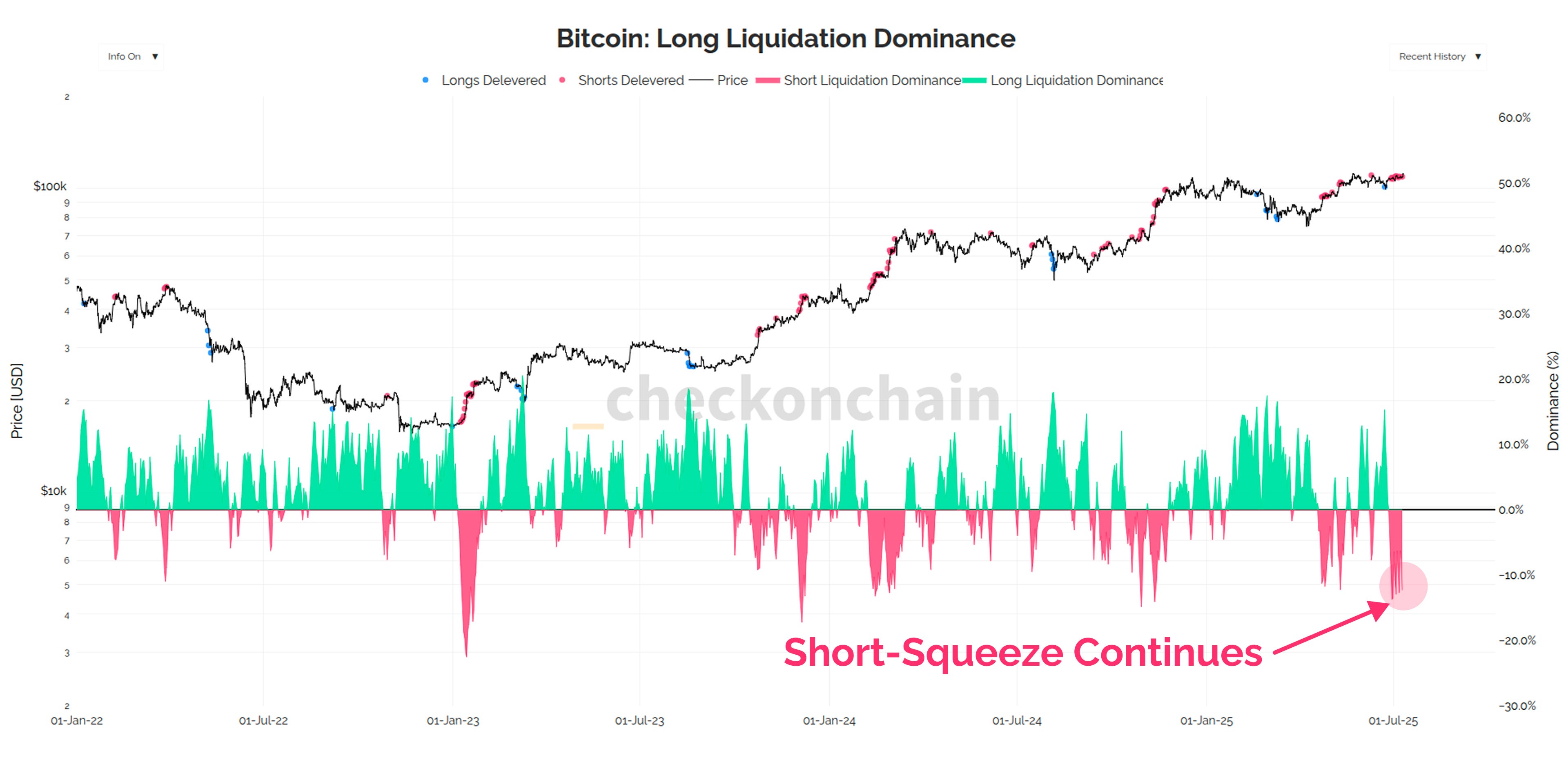
Godspeed to the shorts, I think they send us to $120k once the liquidation levels above the $112k ATH are tapped.
Now please folks, remember that markets are unpredictable, and if we are heading into a regime of higher volatility, and one fuelled by speculation and leverage, we will see wild swings in both directions.
Down to Go Up is a very common pattern for Bitcoin.
I see far more evidence supporting the bull case from here, but please don’t blow yourself up along the way (an all too common experience).

Preparing For Upside
My base case is that the market is ready to pop, so the next step is to build up a framework for key support levels, and to think through where the next stops may be.
Check the Analyst’s job is to provide Check the HODLer with a roadmap for what he thinks is normal and expected.
Check the HODLer then takes that information, and makes his decisions ahead of time, so he knows exactly what he will do IF some scenario happens.
We’re not predicting the future, only preparing the only thing we can control, our decisions.
We can look to the options market as a gauge for price regions which are priced at having a 25% probability of being exceeded by contract expiry.
On the downside, options traders expect us to remain above $95k, which points to a view that chopsolidation has done its job, and constructed a reliable accumulation floor just below us.
On the upside, things get interesting, with the next quarter looking at a move as high as $130k, and the end of the year potentially getting up to $150k.
Long-term readers will know these levels are quite familiar to us, in that they are the zones where most onchain and technical mean reversion models will be fairly overheated.
My current mental model is:
HODLer profit taking likely ramps up around $125k to $130k, and I think most of us can smell prices like this already. It wouldn’t surprise me to get here without much trouble.
Prices above $150k are still fairly expected, with MVRV having traded at higher levels for 10% of past bulls. Steamy yes, but not overcooked.
Once we get near ~$170k, things are getting into the long tail of events, with sub 5% of past trading days being that overstretched. I expect we would need either a solid correction, or a multi-month chopsolidation before we cleared that with ease.
To re-iterate, these are not predictions, but instead areas where Check the HODLer is making decisions about what he is going to do if we get to these prices.
In practical terms, I plan to leave my daily DCA chugging away up to $150k, and will likely switch it off above that, waiting for things to re-find their level.
Should the market reach higher than $150k, I will probably start gradually clearing excess risk such as our MSTY position, and maybe trim some MSTR (especially if the 155d-VWAP model is getting frothy).

If the market does decide that the bulls are wrong, and starts heading lower, I also have a line in the sand near the STH cost basis. One look at the onchain supply heatmap below, and it should be pretty obvious why that $95k to $100k region should hold as support.
I am a very happy buyer of any dip down to that level…
…however, I do not want to see the market trade below it.
It shouldn’t given the macro backdrop, so if it does, then I will need to strongly re-assess my bull bias. I suspect we would see a lot of unrealised losses in that case, and things have tended to deteriorate quickly into bearish trends on similar events.
Not my base case, but a clean and obvious zone to pay extra attention to.

So let’s assume the core thesis is correct, and the market wants higher prices.
The two charts below are a little more experimental than the classic Topping Cloud, and use a 2yr window for computing an MVRV topping zone.
The typical MVRV Z-score metrics you see me refer to look at most of the historical data from the last two cycles, and therefore are reflective of what is normal for MVRV over time.
These models, only look at the last two years, which means we are comparing deviations from the mean only in this bull cycle. It is an attempt to accept that this cycle is its own beast, and old data is not as representative of modern conditions.
Notice how the price levels of interest in this chart, are remarkably in line with the framework presented above, and with options markets.

We can run the same 2yr Z-Score for Short-Term Holder MVRV, and the same price levels emerge.
This is called confluence, where multiple data-sets and market information lines up with a similar story.
As an analyst, this gives me much more confidence to stick with the plan, and until new information comes to light, that is what I will do.
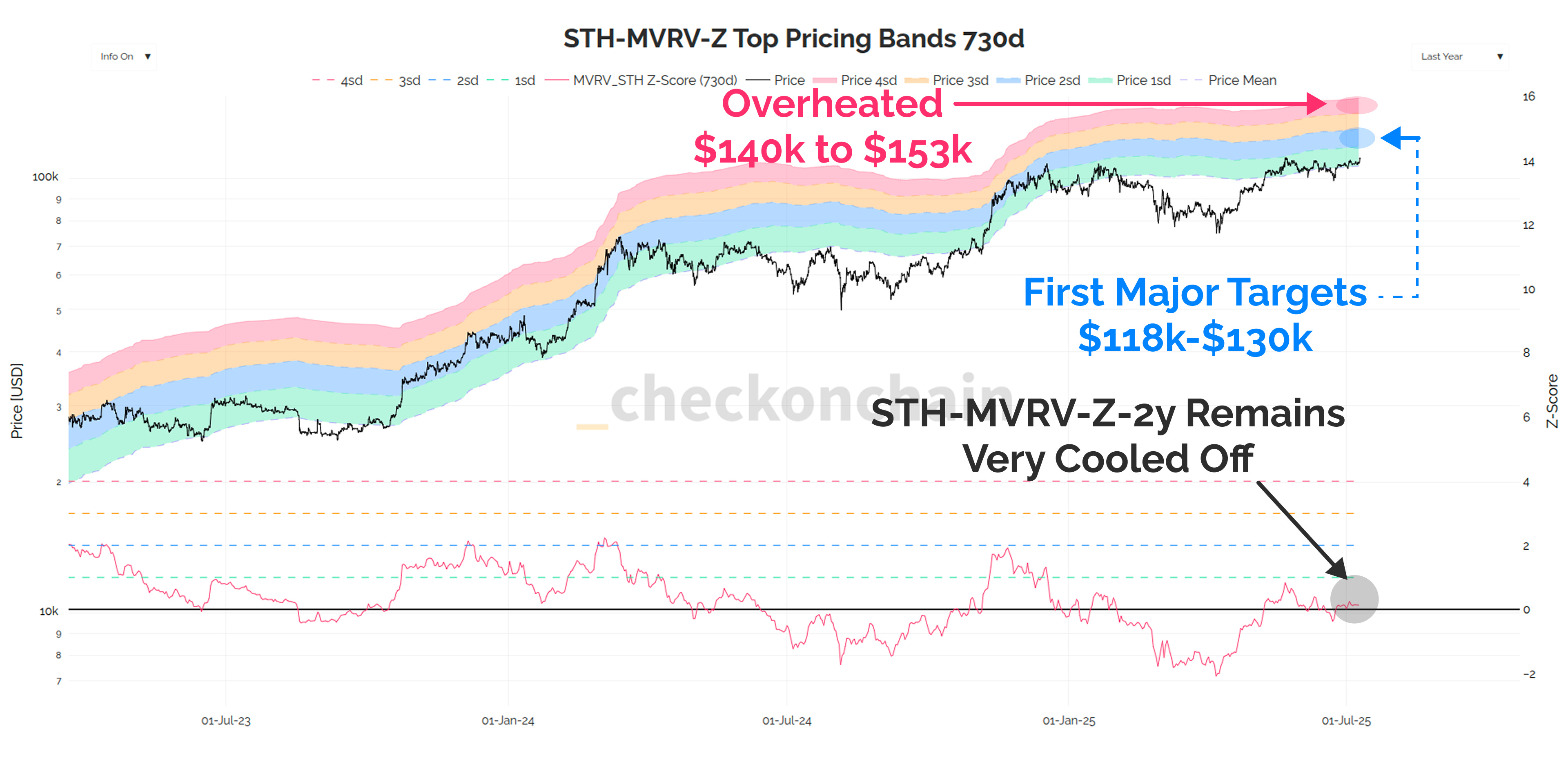
Note: you will find a bunch of these 2yr Z-score topping models under Pricing > Euphoria Zone on the charts suite.
Concluding Thoughts
Whilst many commentators have said that this cycle ‘sucks’, I see it in the exact opposite light. This cycle kicks ass, and the Bitcoin price keeps climbing in a beautifully constructive pattern.
I don’t know whether the topping price levels shown will be reached, now whether they will be THE TOP, or just another ‘A TOP’.
We have seen two ‘A TOPs’ so far, one in 2024, and another in 2025. Both were followed by a healthy period of chopsolidation, which enables the market to acclimate and prepare for the next move.
In many ways, these periods of chopsolidation are similar to little bear markets.
They have the same effect of resetting our collective psychology, and allowing sufficient coin volume to change hands to build up a floor. At some point demand will tap out, and profit taking will over-saturate what remains.
But remember, markets are a process and not a result.
Bitcoin has many years and decades of growth ahead of it, and it will come and go in waves. If those waves keep looking like a periodic 80% to 100% quarter, and then a few months of rest and recuperation…we’re going so much higher…eventually.
Thanks for reading,
James
Looking for an Onchain Data API?
My friend The Bitcoin Researcher has just rolled out a new API for Bitcoin onchain data which has just about every metric you’d want. I’ve had a few folks reach out looking for API access, and I highly recommend checking this service out if you’re interested in playing with the underlying data feeds.
The timing of this piece 🤌
Spot on calls in this one. This aged incredibly well... and it's only been 16 hours :) Lets go BTC 🚀