

Visualising Top Heavy Markets
Bear markets start when too many people, buy too many coins, at too high of a price. Today we will visualise Top Heavy markets using onchain tools, to help visualise the problem.

G’day Folks,
Markets are infinitely complex, and this makes the task of analysing them accurately extremely difficulty (but also so much fun!). To combat this, as with many things in life, we must develop simplified models, and frameworks to think through the problem.
My framework for spotting bear markets, is when too many people, buy too many coins, at too high of a price.
How much is too much?
It depends…
Fortunately for us, in the world of Bitcoin, we have unparalleled transparency into the cost basis of the entire supply. This helps us visualise, and then think through that problem, and identify periods of maximum risk.
The general structure of a Bitcoin market cycle comes in two phases; the hardcore, high conviction HODLers buy low…and then they sell high to new demand, traders, speculators, and future HODLers to be.
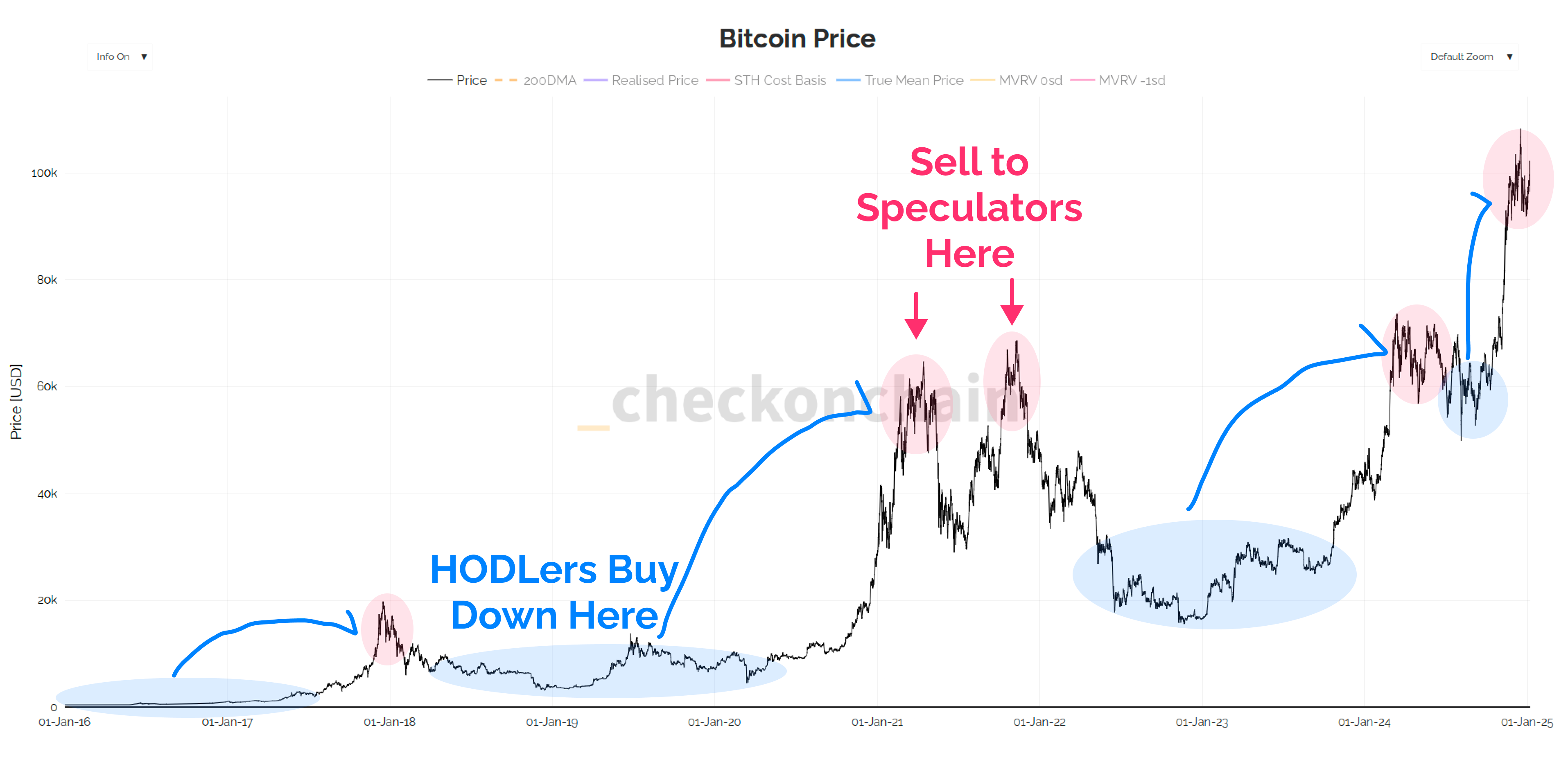
The second phase is the nasty one, the hairy back of the bear.
Savage drawdowns, and unrelenting sell-side work to shake out those speculators, and forge the conviction of the HODLers-to-be via a trial by fire.
Most folks don’t survive this process, and a huge number of them capitulate at the absolute bottom tick…thinking ‘I just can’t do this anymore…I’ll buy it back lower’.
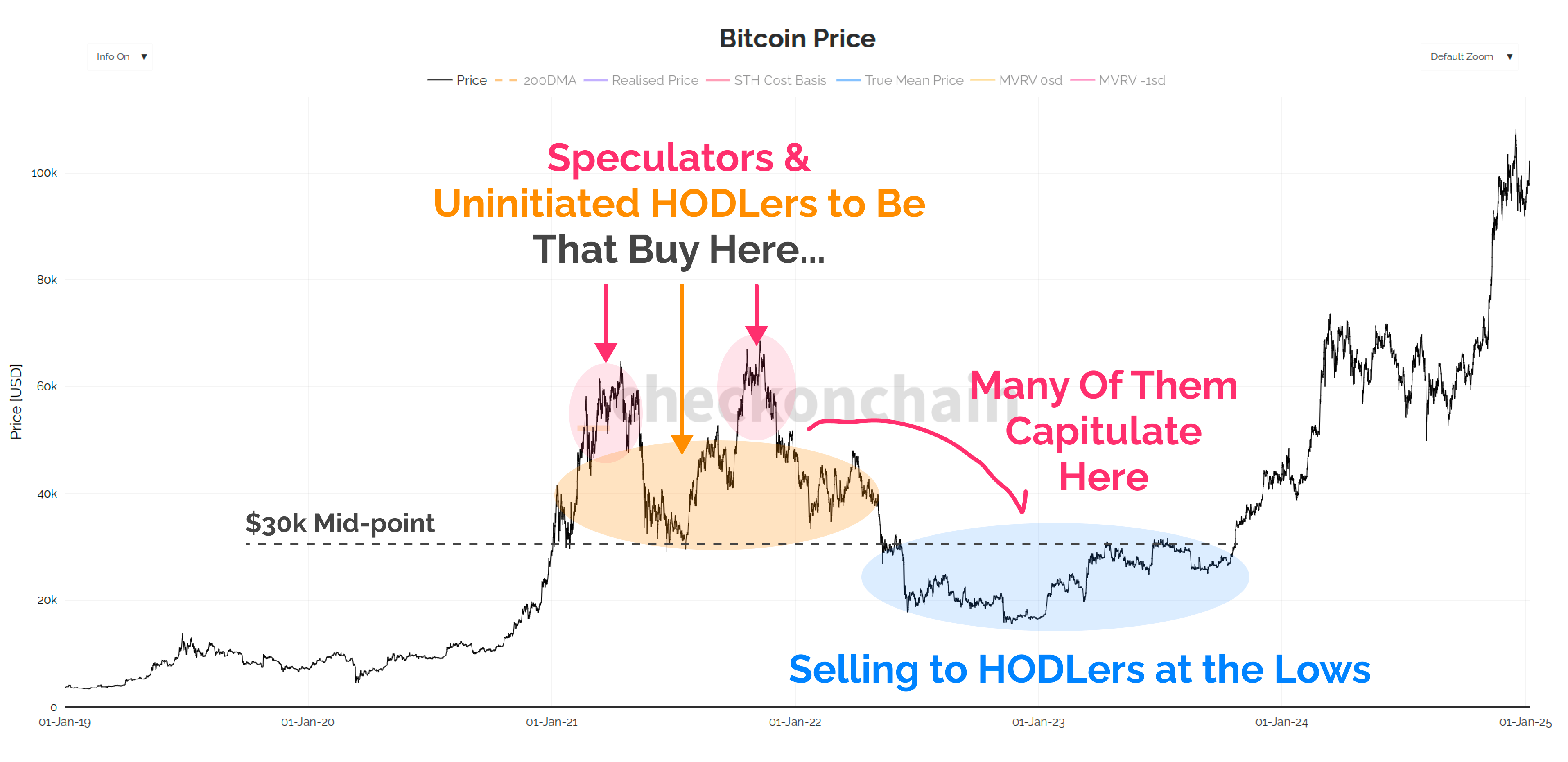
In today’s post, I am going to take you through a set of tools I use to help visualise Top Heavy Markets. We’re trying to find points in time when too many people, bought too many coins, at too high of a price.
We’re going to cover the following topics:
Understanding Top Heavy Markets, and bear market risk.
The difference between Supply in Loss vs Unrealised Loss.
How to interpret the URPD charts (which are now live on charts).
Two case studies from the 2021 cycle, to equip us for 2025.
What the final capitulation event looks like.
Let’s get stuck into it!
📈 Reminder: you can find the charts from our articles on the Checkonchain Charting Website, and a guide in our Charts Tutorial Video.
Premium Members will find the TL:DR summary, video update and the rest of the written post below. Consider upgrading to premium today to unlock the rest of the content!